

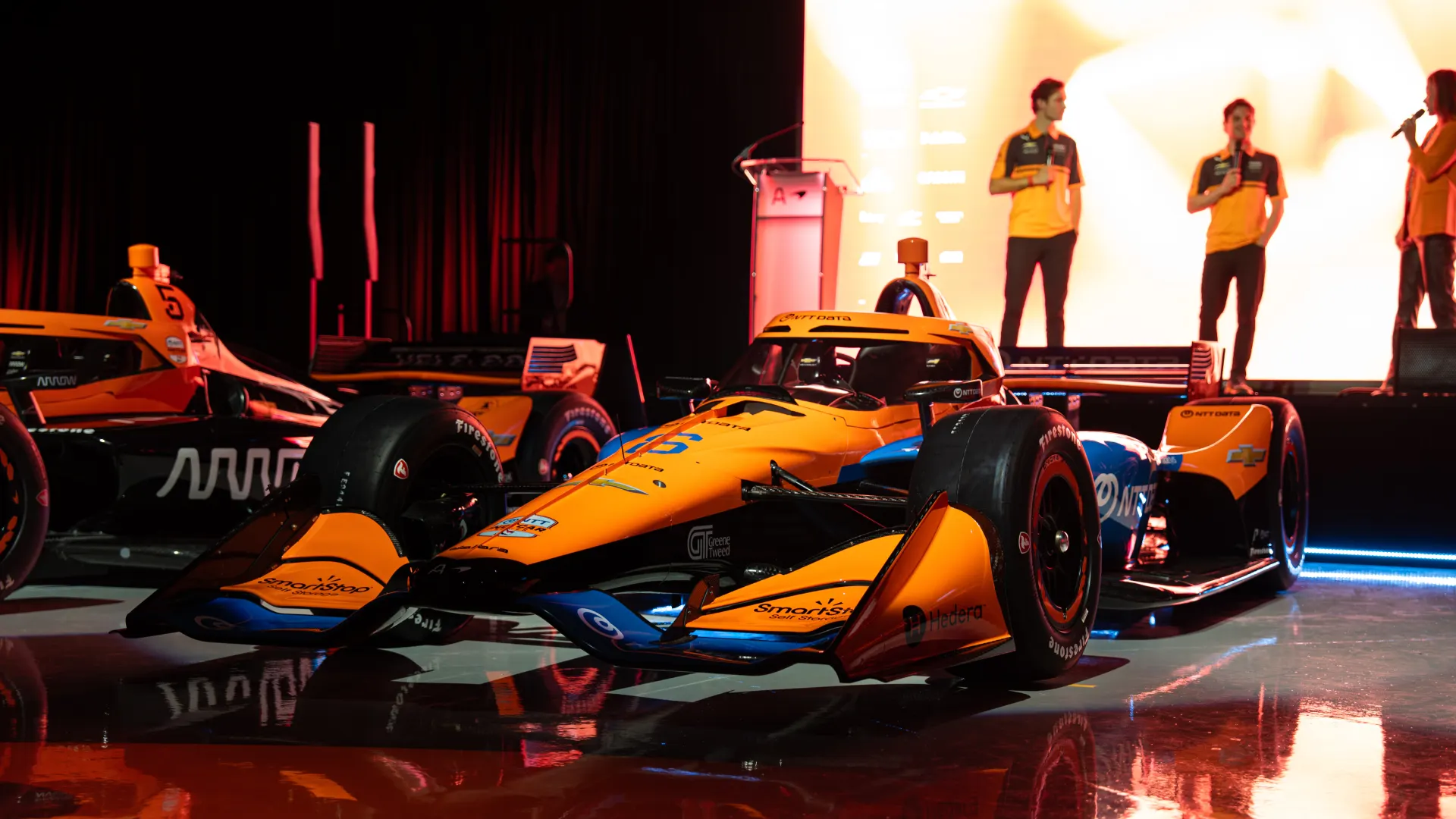
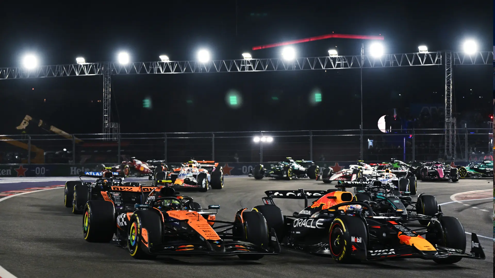
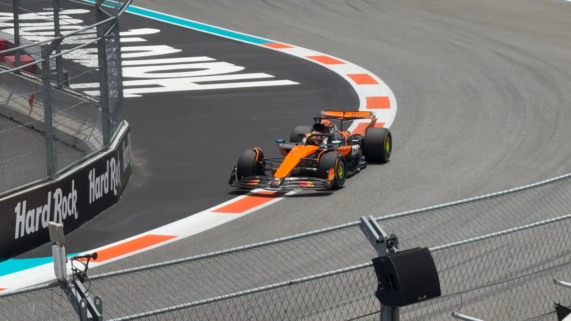
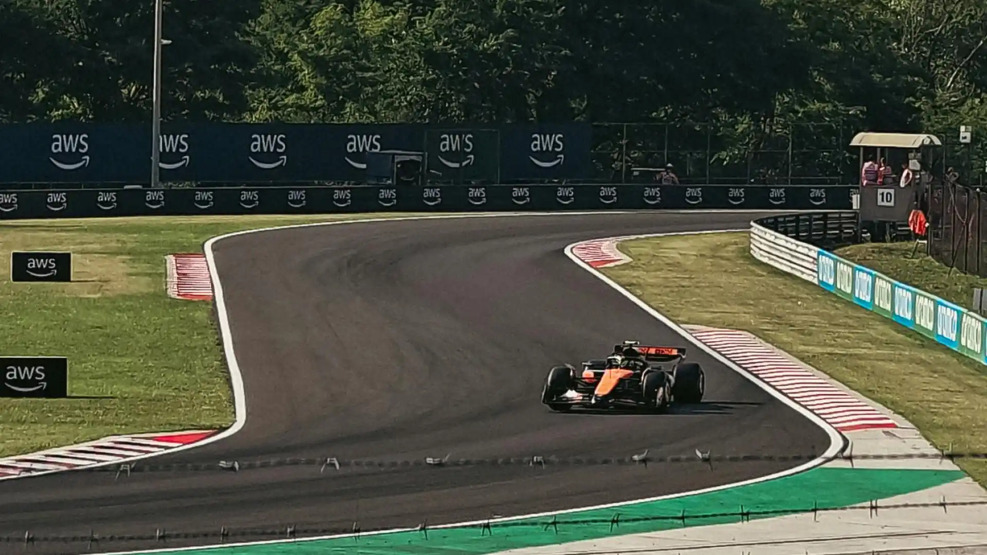
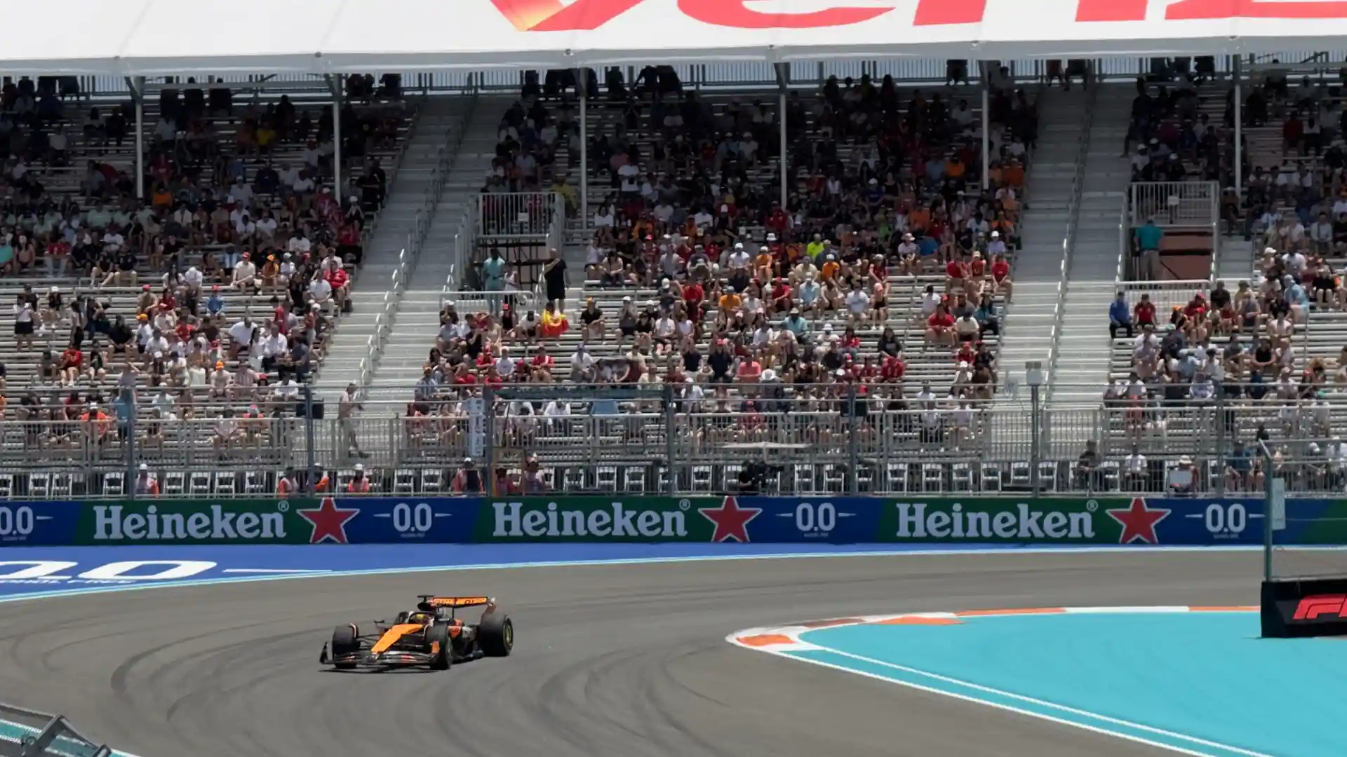
Whether it’s ripping by at 230mph or stationary, it’s nigh impossible to miss a McLaren race car—the vibrant papaya lighting up a track in the sunshine or floodlights. And while design may seem like an afterthought for a race team hell-bent on winning, the truth is that the visual elements are just as integral as the fuel, taking significant work and care to ensure the story for the team and its partners remains clear at all speeds.
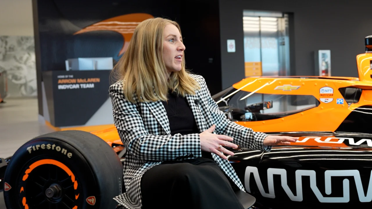
“It’s a little bit of an army’s effort, but it comes together,” shared Lauren Gaudion, Vice President, Marketing and Communications at Arrow McLaren, when she gave us a walkthrough of the livery design process.
After talking at length with her and spending a day at the new McLaren Racing Center, we put together this detailed look at the four essential elements that must work in tandem to bring an IndyCar livery to life.
Element #1: One Team, One Brand
For a team of McLaren’s size—more than 1,100 personnel around the world—no one car, or even one team, runs in isolation. Everything related to the brand has been centralized to ensure clarity, cohesion, and recognition.
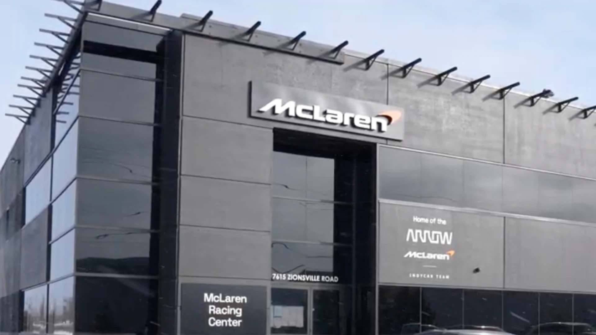
For McLaren, all roads lead back to the Brand Creative Team, based at the McLaren Technology Centre (MTC) in Woking, UK. If you think of McLaren as an airport, this team operates like an air traffic controller, maintaining the ‘single source of truth’ for how McLaren shows up internally and externally, whether that be brand creative, social media, the website, and more.
“McLaren's doing even more effort today than ever before to keep the teams unified,” Gaudion explained. “So rather than us being the Arrow McLaren IndyCar team, and then there's the McLaren MasterCard F1 team, we have those different entities, but they're all able to pull from a McLaren Racing resource.”
The Arrow McLaren team in Indianapolis then works with the Brand Creative Team to execute on initiatives like the livery launch.
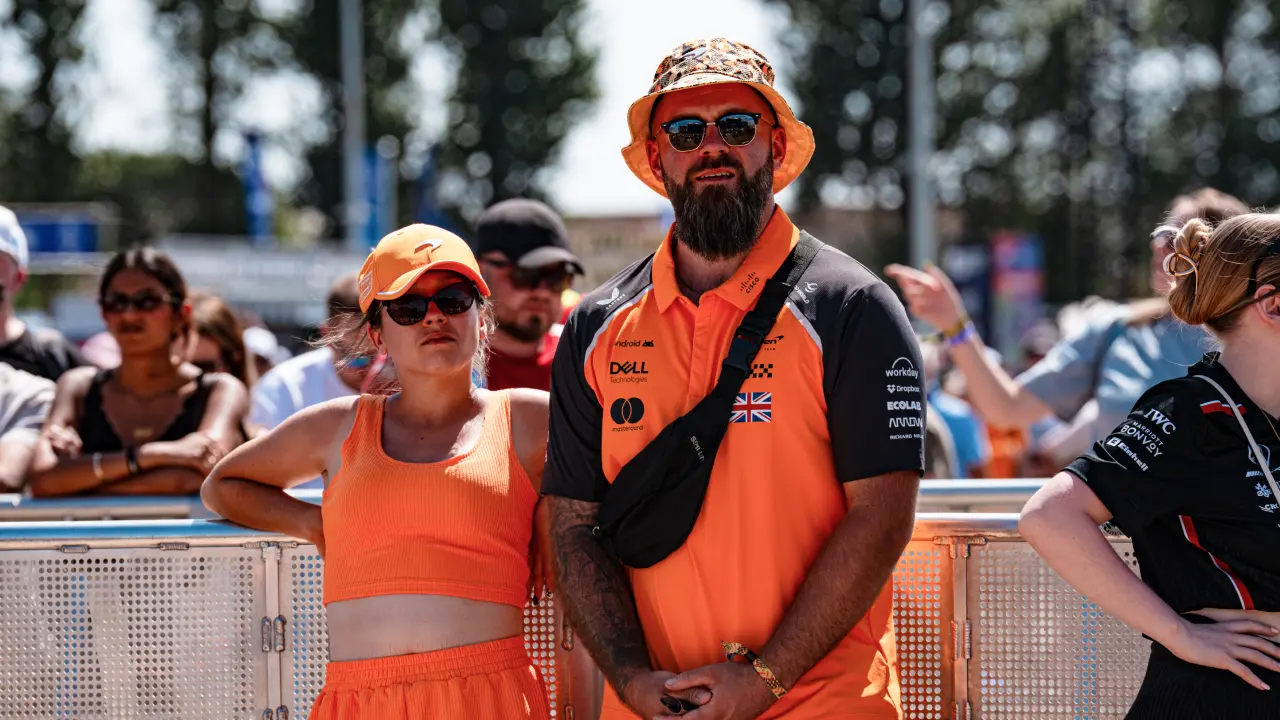
The end result? When fans, partners, and even the team themselves spot papaya (the special shade of orange for the uninitiated) on track they know it’s a McLaren. Fans that buy a McLaren F1 shirt can then wear it to the Indy 500 and still feel like part of the family. Partners of McLaren in IndyCar can benefit from the team’s reach and credibility even when McLaren’s away racing F1 in Europe or the Middle East.
But it’s not just about looks; it’s also about messaging.
Gaudion was quick to point that out with the specific language used (“McLaren Racing Center”) and even the three showcars sitting behind her: a McLaren IndyCar, Formula 1 car, and roadcar. “While McLaren Racing is a different entity than McLaren Automotive, we still have that collective brand that we're able to work with and really want to make sure that McLaren fans are fans of all of it through and through.”
Element #2: Clear Design Philosophy
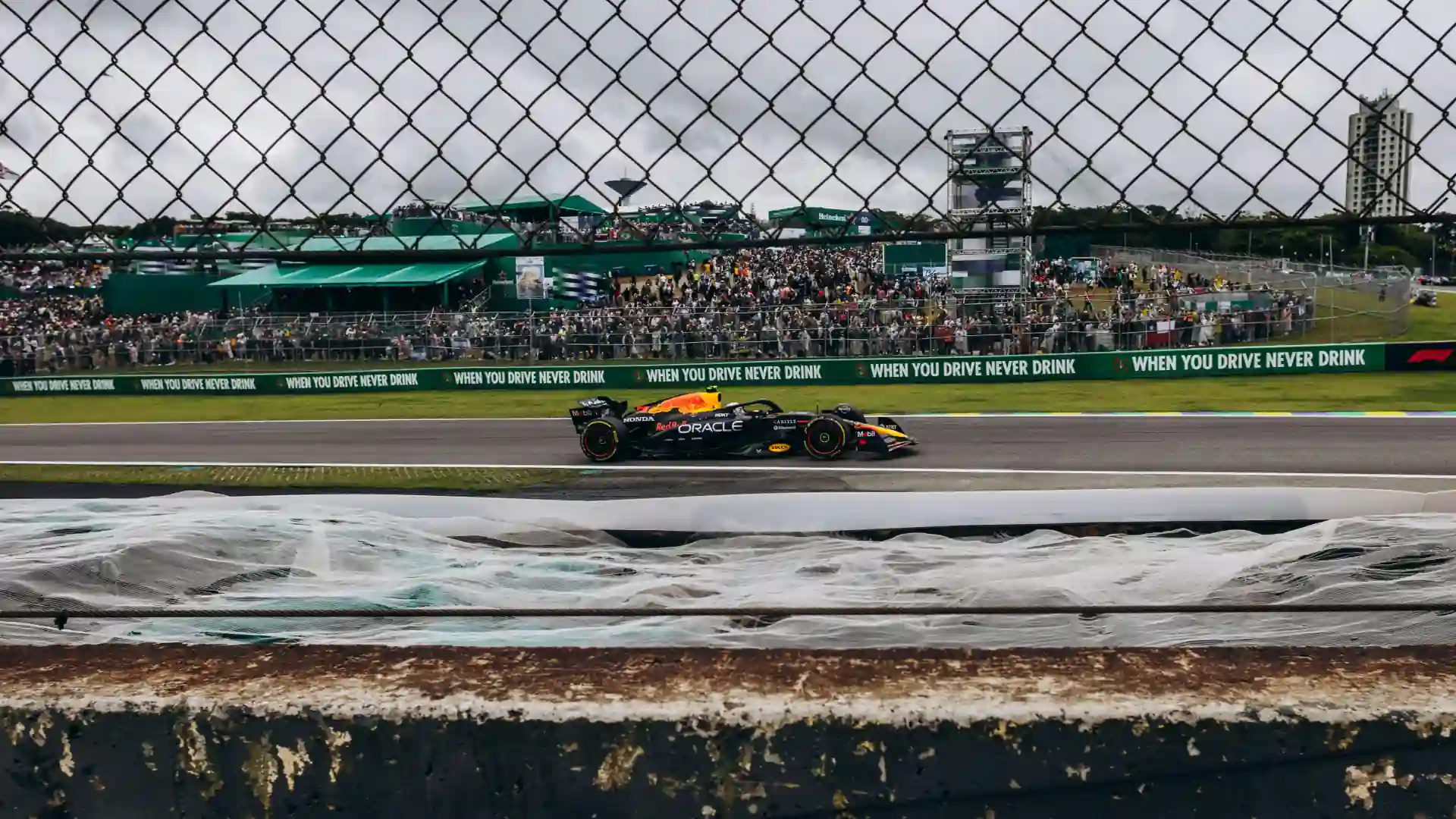
IndyCar is infamous for needing spotter guides to, well, spot your favorite drivers on track, as livery designs change week-to-week with major sponsors. In the case of McLaren and select other teams, we learned that the scale has tipped in favor of the teams, leading to greater consistency for fans and limited flexibility for partners and drivers.
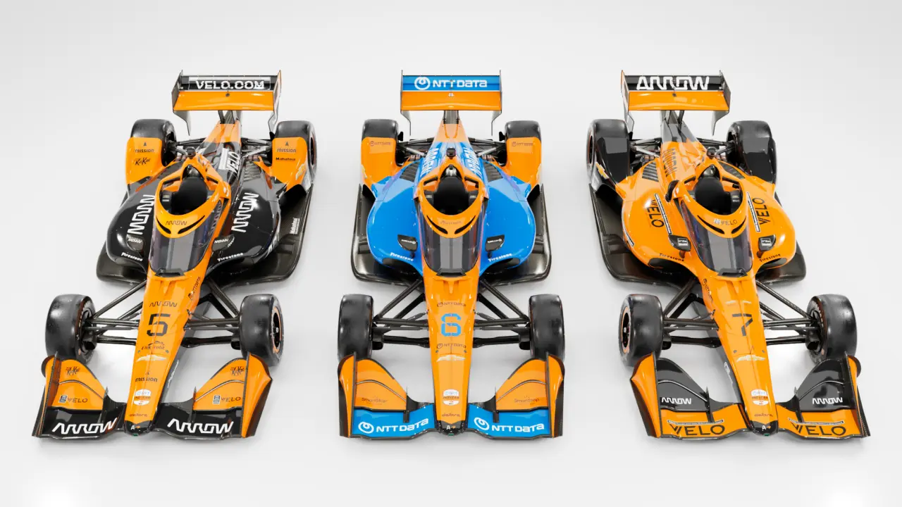
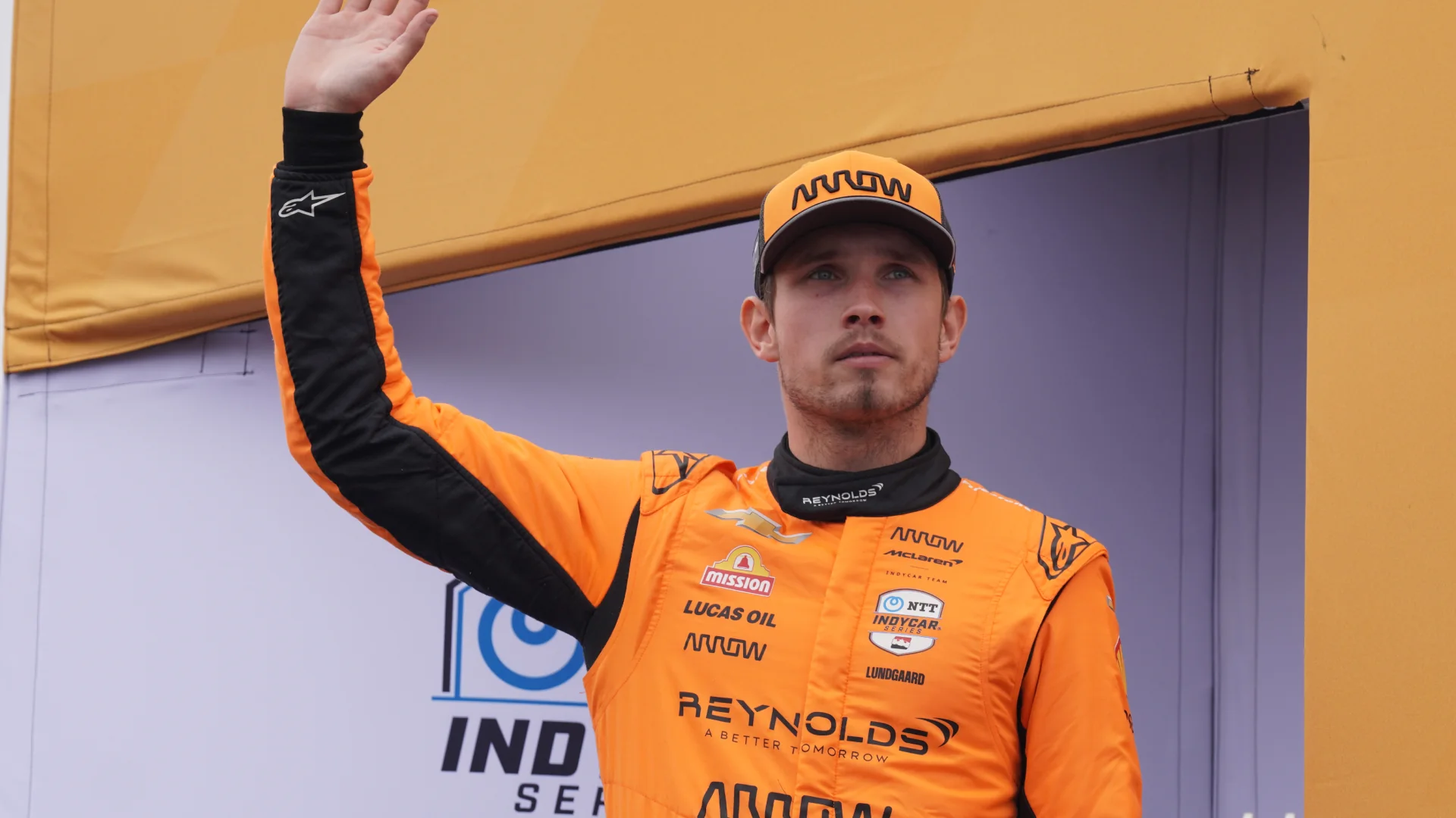
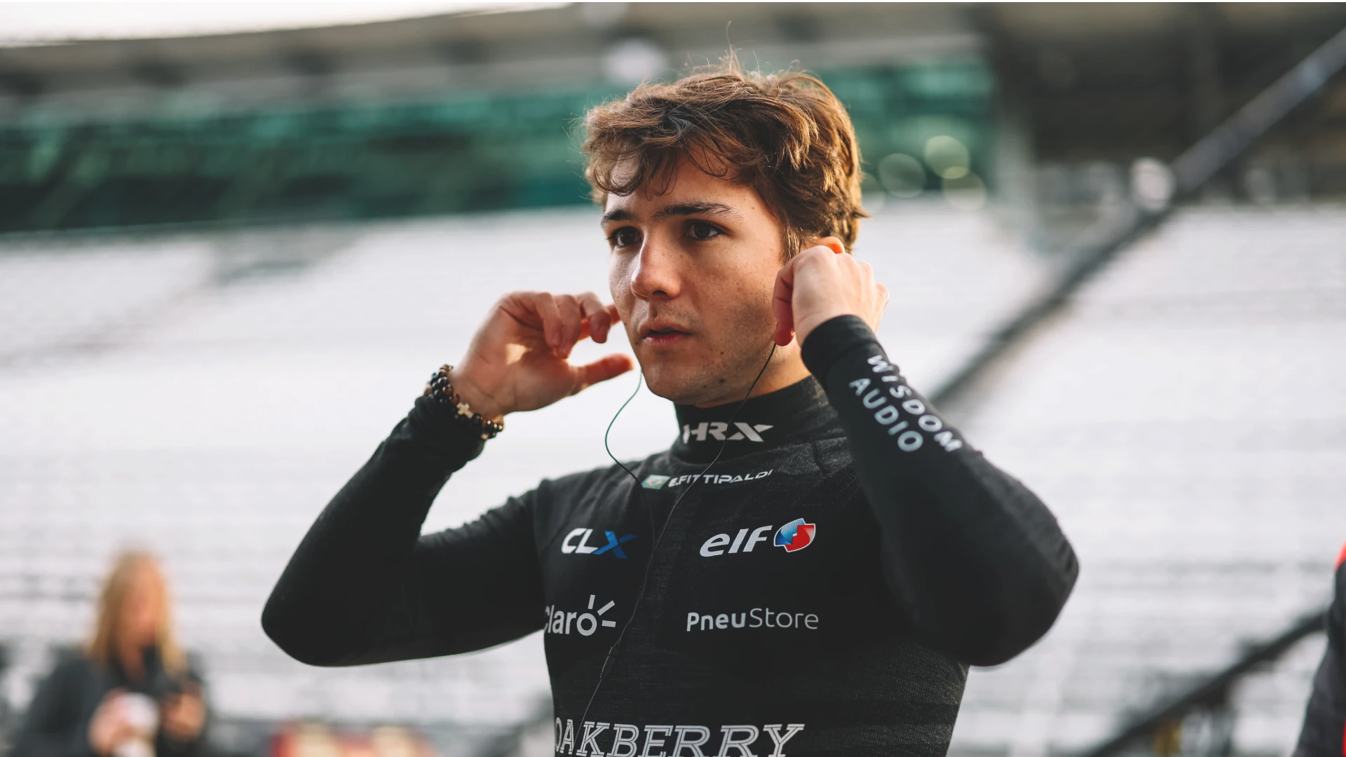
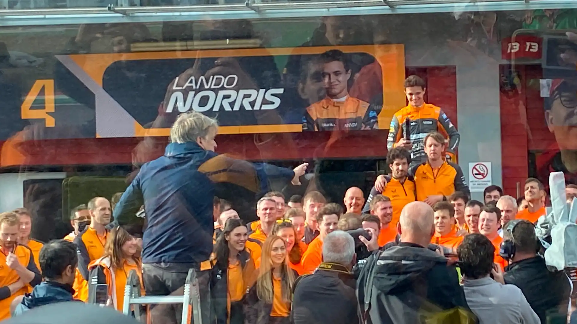
What does that mean in practical terms? For a team like McLaren who can maintain a very clear brand identity, the liveries change little year-to-year. Even the drivers have little say; Pato, Christian, and Nolan are given freedom only when it comes to their helmets.
The team does work with sponsors to incorporate them in new and creative ways (more on that shortly), but the overall impact is limited. Perhaps the most significant example we understood was with their primary partner NTT DATA, which has injected a healthy helping of blue into the #6 car.
What does change is the theme, or as we understood it how the brand is showcased and spoken about. For 2026 that theme is “focus,” a direction set by both Andrea Stella on the F1 side and Tony Kanaan on the IndyCar side.
“They've been using that as a keyword in a lot of their internal team speeches. You'll see it in their media interviews,” said Gaudion. She stressed it will also affect the creative output, with crisp lines, specific angles in photographs, and even how they turn up the intensity to hype up fans.
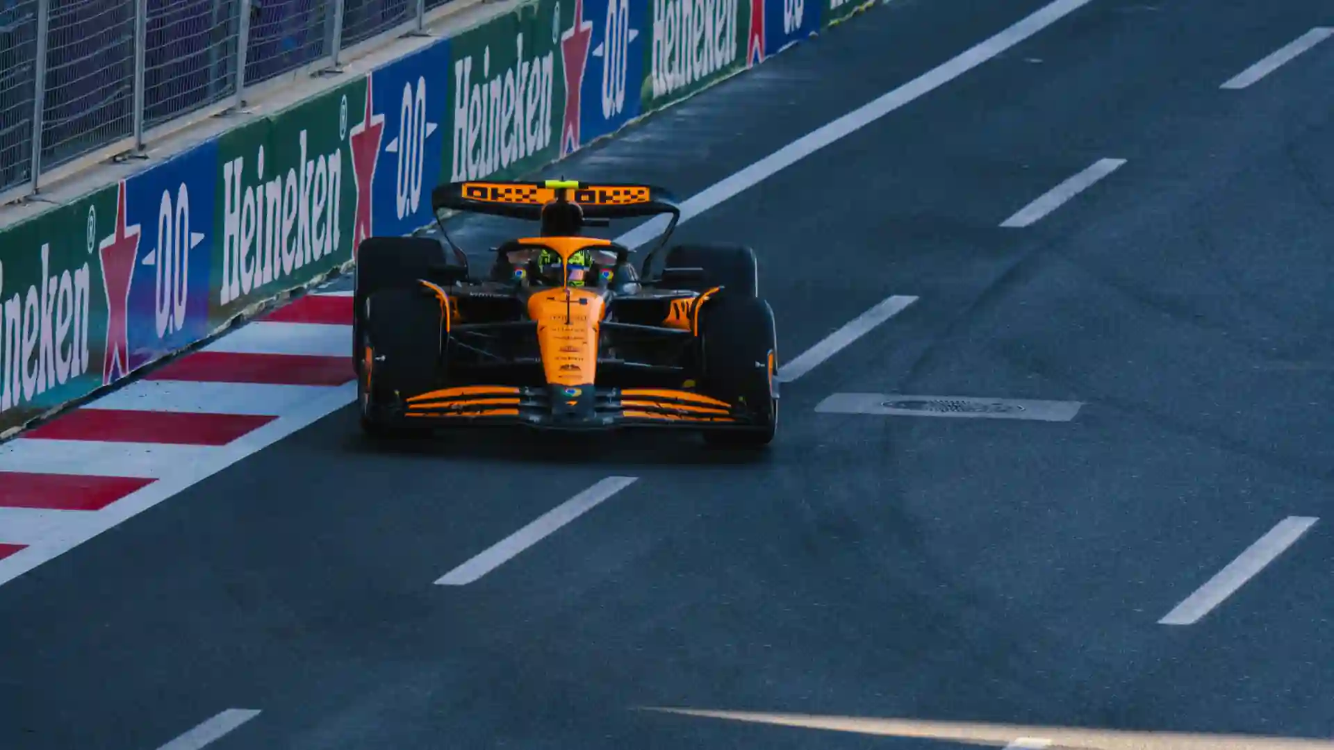
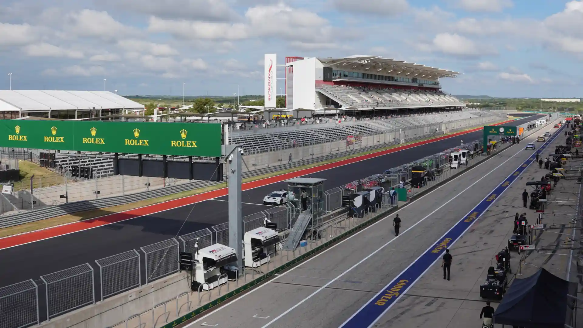
The other design changes are operational. With cars moving so quickly, and so many on the grid at once, visual cues for pit crews and spotters are mission critical. Gaudion noted a specific challenge for 2026: ensuring the fronts of the #5 and #7 cars look distinct coming down pit lane so a mechanic doesn't instinctively jump out for the wrong car.
The boldness and placement of the car numbers, the color choice for the aeroscreen rim and sidepods—all of these elements affect visibility and therefore performance and safety. For a team that is so heavily papaya, those choices matter even more to make sure the right people are focused on the right car.
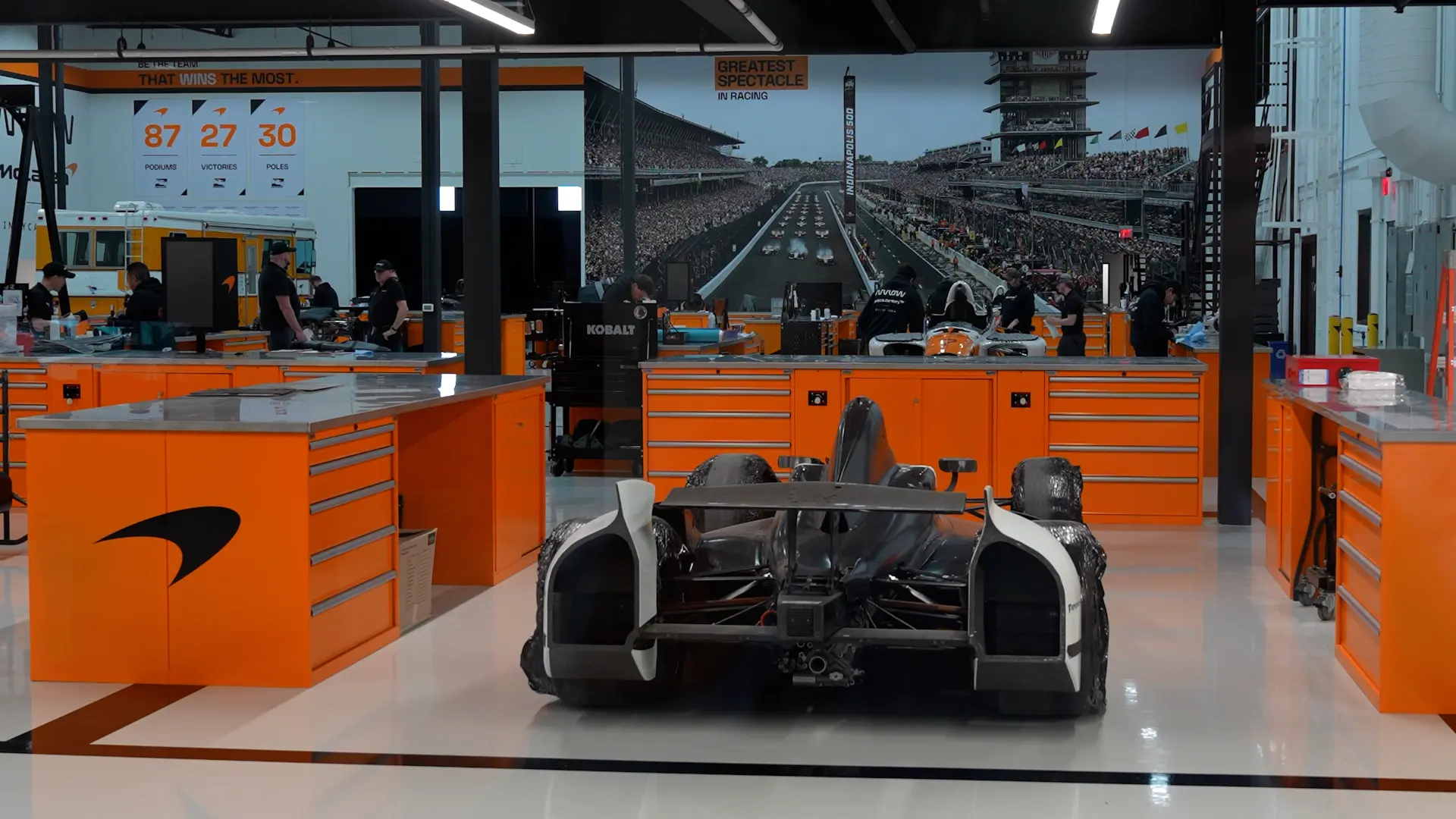
Element #3: Executional Prowess and Creativity
With branding and design direction locked, everything shifts to execution and week-to-week adaptation. Larger livery projects, like the Indy 500 cars, start the design and layout process months and months—or even over a year—in advance.
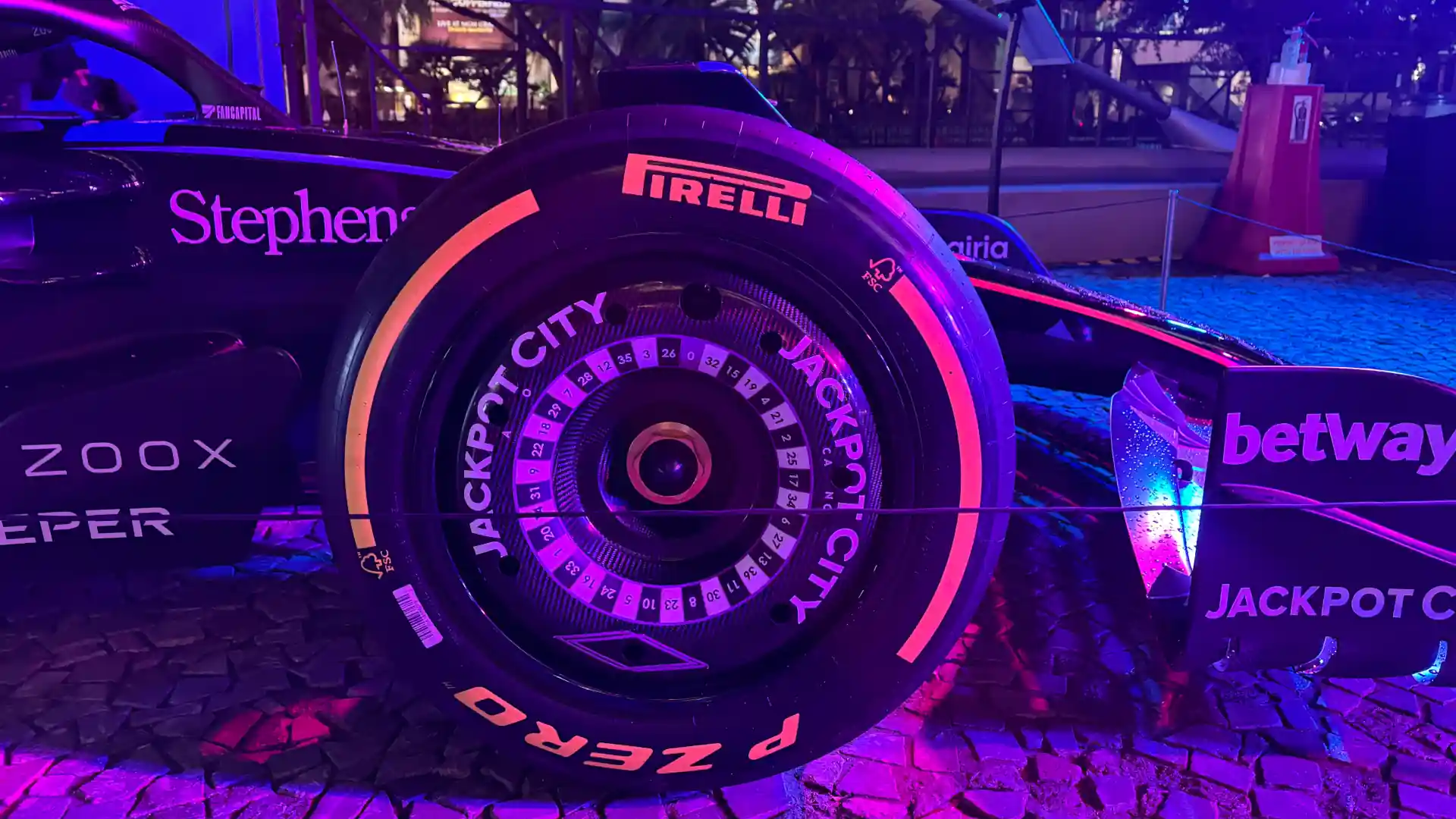
That lead time is invaluable, especially with so many different partner logos to incorporate. As Gaudion explained, while McLaren has their own brand standards, many partners come with their own sets of non-negotiables. For example, Chevy’s metallic bow tie and the IndyCar logo are both printed in full color. Some brands may have an all-white variant but the minimum size becomes a constraint.
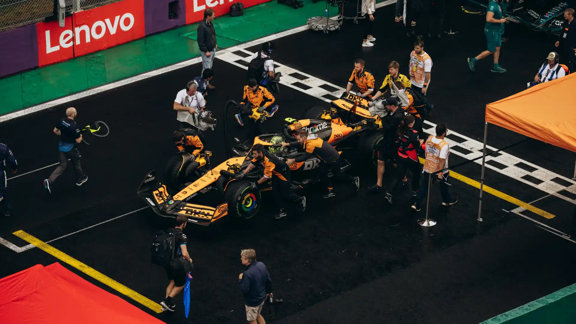
Juggling all those aspects and knowing partners can change week-to-week means McLaren must operate with extreme precision. It takes roughly eight to 10 hours to vinyl wrap a car, which means tight turnarounds between races and little room to correct for errors.
To manage this, the team has a rigorous review process. Gaudion told us that “before every race, there are four people from Vinyl and Partnerships that do a walkaround to make sure every logo is right where it’s supposed to be.”
They’re also checking the team kit. Nolan Siegel, for example, has three distinct sets of firesuits and Nomex for the season, each with different logo combinations that must match the specific livery he is running that weekend.
Yet, even with these strict constraints there is still room for innovation. McLaren has played with unique logo placements, like the PUMA logo on the halo support behind the aeroscreen. And for 2026, the team’s R&D department worked with the vinyl supplier to introduce a higher-gloss finish. This improves the aesthetic while also making it easier to clean rubber and oil off the bodywork, saving the crew valuable time during the race weekend.
Element #4: Cohesive Ecosystem
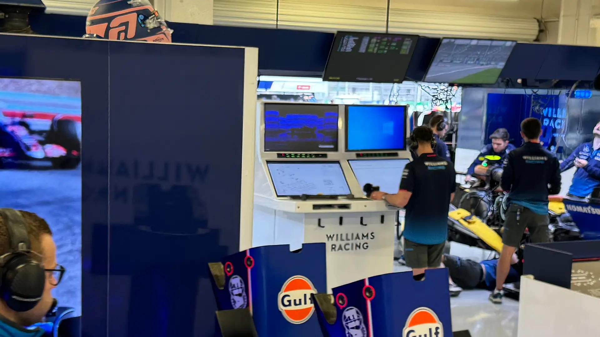
Going back to the airport analogy, if the Brand Creative Team is air traffic control and the car livery is the plane, everything else—the haulers, the team kit, the timing stands—needs to naturally fit into the airport setting such that it looks like one functional entity from all angles.
A ‘McLaren metaverse’ if you’ll humor me. Thankfully, Gaudion did.
“It really is, because you'll see our transporters, you'll see the different track equipment, and that all aligns with the design of the car,” she said. “Even our team kit... that's all considered in how we are bringing in the Papaya more this year to our brand.”
But the ecosystem extends beyond the paddock. Gaudion emphasized the goal of embedding McLaren into culture and showing up in unexpected places—like a surprise appearance on the cover of Men’s Health. It’s a strategy designed to keep the team top-of-mind during off weeks while extending their reach to new audiences who might not yet know about qualifying laps or tire strategy.
The Papaya Army
At the end of the day, the drivers and their cars will always be the stars of the show. But as we learned during our day at the new McLaren Racing Center, those stars are powered by a global machine that ensures every one shines exactly the right shade of papaya.
As Gaudion put it: “We're fortunate that across our three cars, it's all papaya. In IndyCar, especially, you don't see that across a lot of teams. You'll see one team, even the shirts that they wear at the racetrack being yellow, and then the next crew on the same team is wearing red and then green. So for us, we really do look like a papaya army.”
Come St. Pete, that army will be impossible to miss.


.jpg)


.webp)


.png)
.png)